

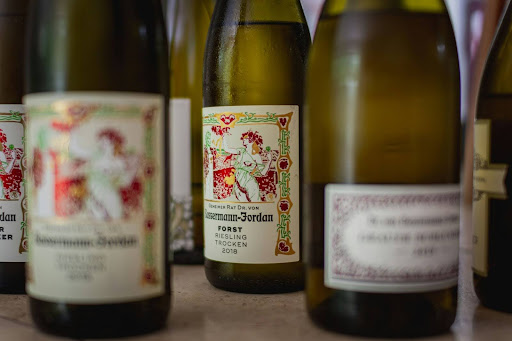
The brutal truth about wine selling sits uncomfortably with many producers: consumers frequently select bottles based on labels rather than contents. After two decades designing packaging for vineyards and advising on high quality wine bottling solutions, we’ve observed thousands of purchasing decisions across tasting rooms, retail shelves, and online stores. The pattern remains consistent—visual appeal drives initial selection, especially among casual consumers navigating unfamiliar wines.
This reality doesn’t diminish the importance of what’s inside the bottle, but it does underscore the critical nature of packaging design. Here are five essential considerations for creating labels that capture attention and open wallets:
1. Strategic Differentiation Within Constraints
Wine label design operates within a fascinating paradox: you must simultaneously signal belonging to a category while standing apart within it. A Burgundy producer making radical departures from traditional label elements risks confusing consumers, while a California brand using entirely expected design tropes disappears into marketplace noise.
The sweet spot? Balance familiar signals of quality and visual shortcuts that help consumers classify your product with elements that create meaningful distinction. Perhaps your Champagne label maintains traditional typography and colour schemes but introduces an unconventional shape or unexpected texture. These calculated departures create recognition without sacrificing differentiation.
2. Typography Hierarchy That Guides The Eye
Effective wine labels establish a clear visual hierarchy—guiding consumers through information in order of importance. Which elements deserve prominence depends on your specific selling proposition: Is your brand name the primary asset? The vineyard designation? The varietal? The vintage? The region?
Decide what matters most to your target audience, then design accordingly. Size, weight, colour, and positioning of text elements should create an intuitive reading pattern matching your strategic priorities.
Amateur labels typically suffer from democratic typography—giving equal weight to everything, effectively emphasising nothing. Professional designs understand that visual prominence equals perceived importance.
3. Colour Psychology Beyond Personal Preference
Colour selection transcends aesthetic preference, functioning as sophisticated visual shorthand. Metallic gold communicates premium positioning, but risks appearing pretentious if overused. Deep blues evoke trustworthiness and tradition. Bright, saturated hues suggest accessibility and modernity, but may alienate serious collectors.
Consider also how your label will appear in different contexts—the warm lighting of restaurants versus harsh fluorescents of retail settings. Colours shift dramatically under different illumination, potentially transforming your carefully selected palette into something unintended.
Pro design tip: Test mock-ups in actual selling environments rather than relying solely on digital renderings viewed on calibrated screens.
4. Tactile Elements That Trigger Purchase
The physical interaction between consumer and bottle plays an underappreciated role in purchase decisions. Textured papers, embossing, debossing, foil stamping, varnish treatments—these tactile elements create multisensory experiences that digital competitors cannot replicate. When a shopper picks up your bottle, their fingertips should register something distinctive.
These physical enhancements need not require exorbitant production costs. Strategic application of texture to specific label elements often proves more effective than covering entire surfaces. A subtle emboss on a logo or selective use of spot varnish can create memorable tactile moments while maintaining production efficiency.
5. Storytelling Through Visual Shorthand
Every successful wine has a story—about its origin, production methods, or the people behind it. The challenge lies in communicating these narratives through visual shorthand rather than paragraphs of back-label text that few consumers read. Effective labels translate brand stories into visual elements that communicate instantly.
A family winery might incorporate subtle heraldic references; a producer emphasising sustainable practices could utilise nature-inspired patterns or earth tones; an experimental winemaker might embrace unconventional layouts, signalling innovation. These visual cues telegraph your positioning more efficiently than explicit claims.
The finest wine label designs balance timeless principles with contemporary relevance. They respect tradition without becoming trapped by it. They understand that while wine itself may improve with age, packaging must remain current with evolving consumer expectations and retail environments.
Creating truly effective wine packaging requires temporarily suspending winemaker pride and adopting a consumer perspective. The label exists not only as a creative expression but, more importantly, as a sophisticated selling tool—one that should strengthen your brand positioning, enhance perceived value, and ultimately move bottles from shelves into shopping carts.